Role: Head of Design, hands-on.
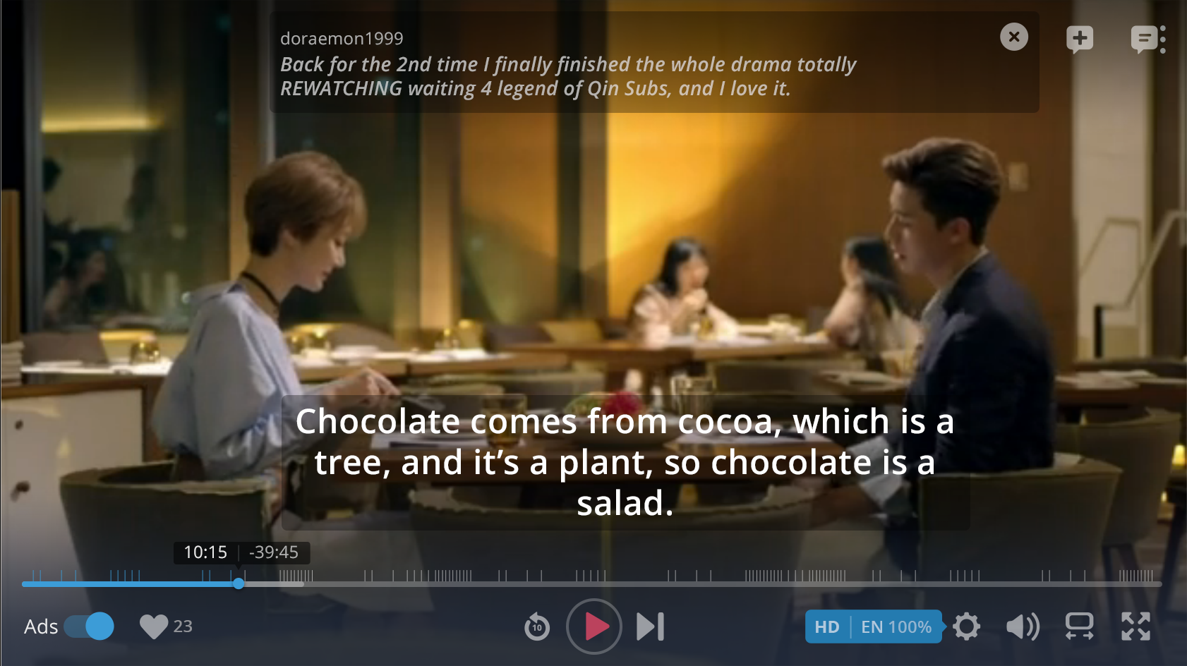
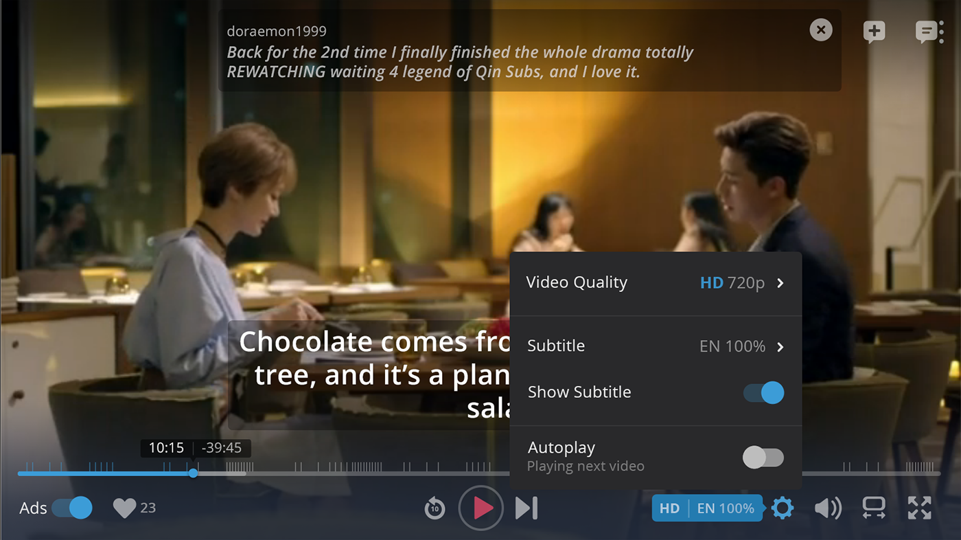
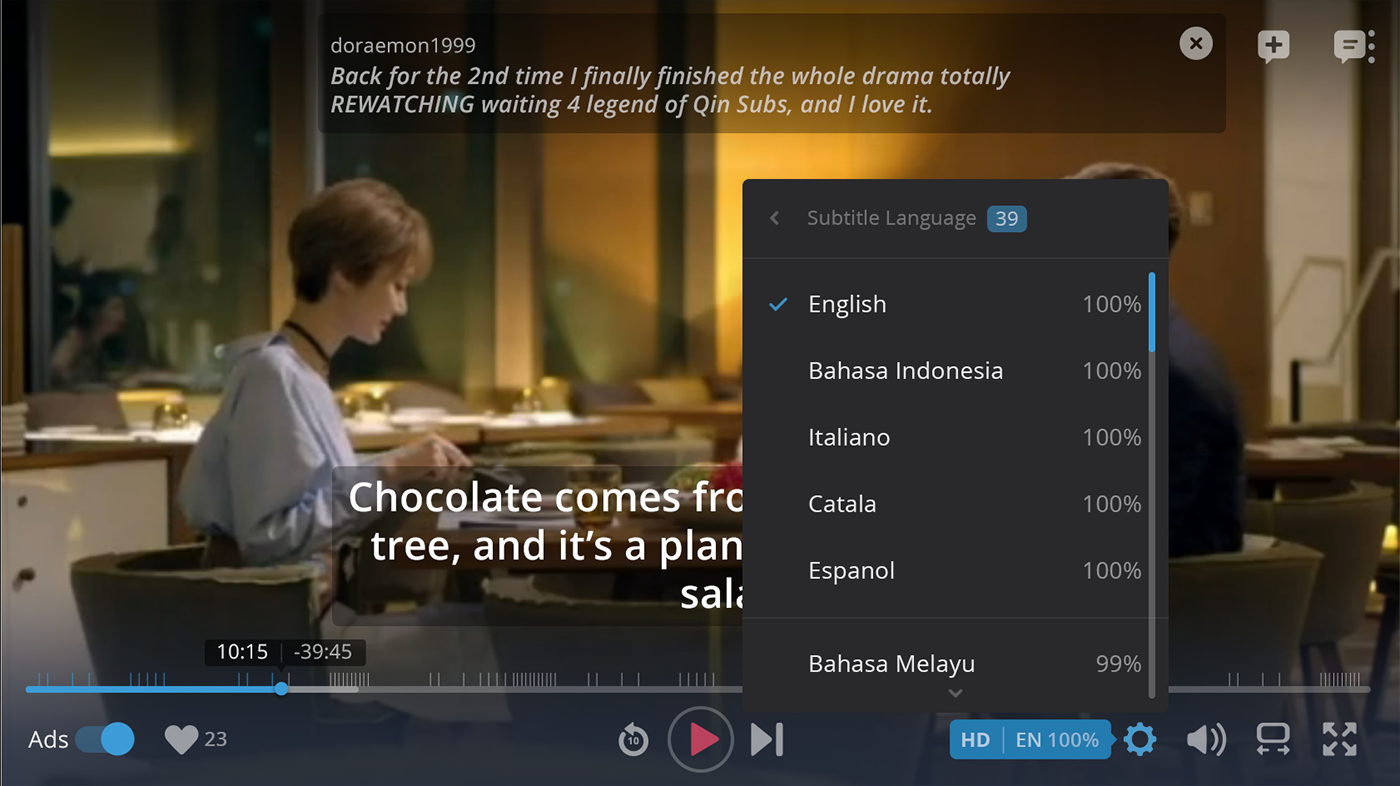
This was a redesign of Rakuten Viki's Video Player, with the goal to minimize distractions and creates an engaging experience for the users who are watching shows with timed-comments.
The improved video player design
The old player
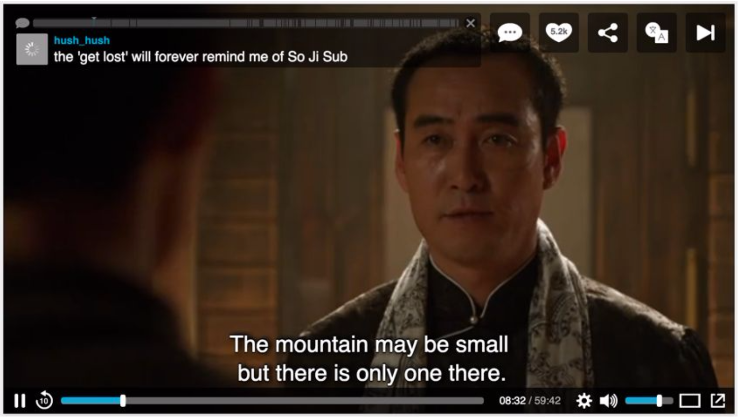
Rakuten Viki's old video player has unclear information, unclear grouping of actions, and sharp-edged icons that appear cold and dangerous. Placement of buttons are not strategically positioned to fit users’ needs (e.g., share icon which is not used favorably by users is placed at a prominent area on the video player, between the “like” and “subtitle “ buttons).
The design approach and details
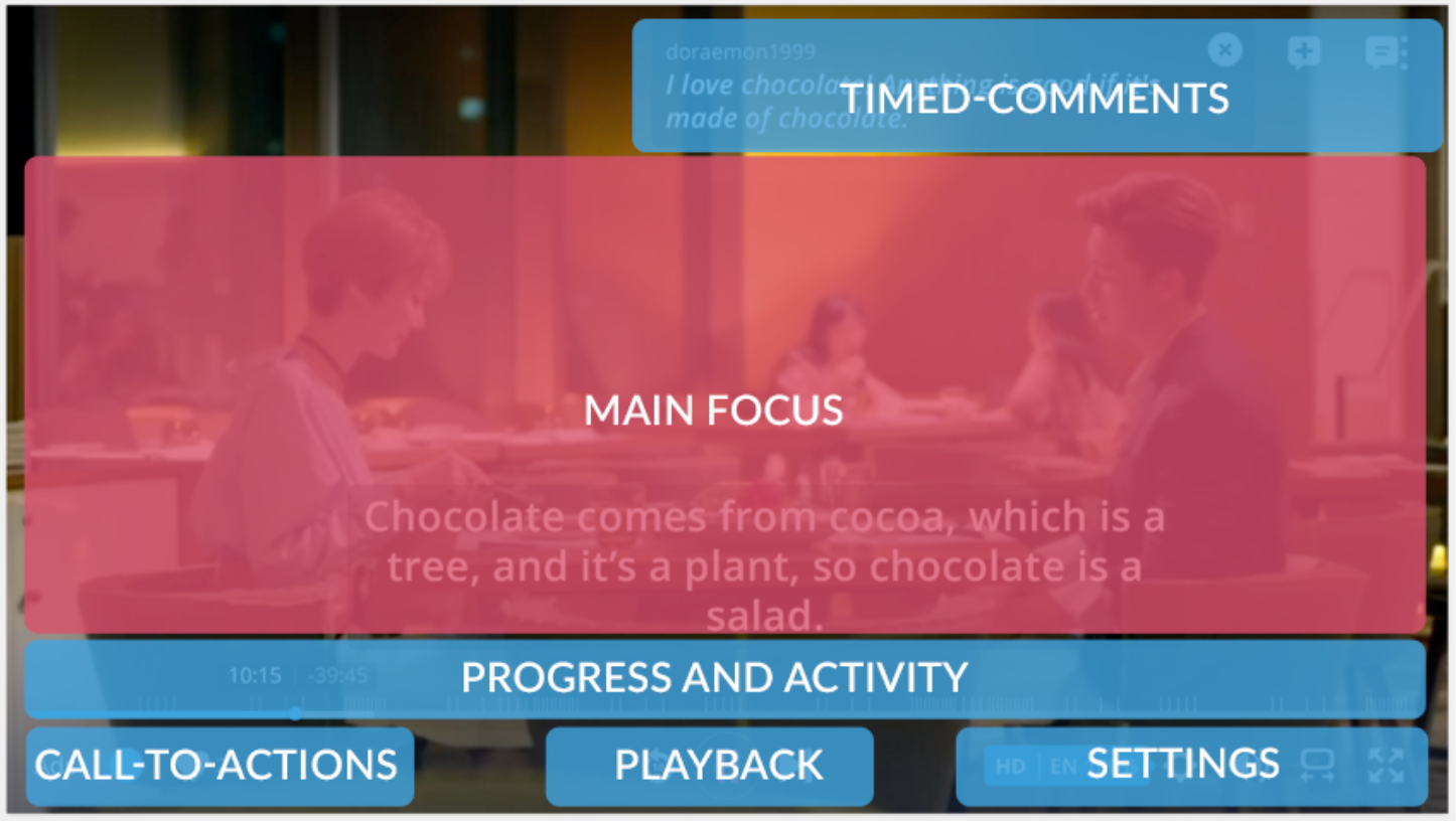
Better grouping.
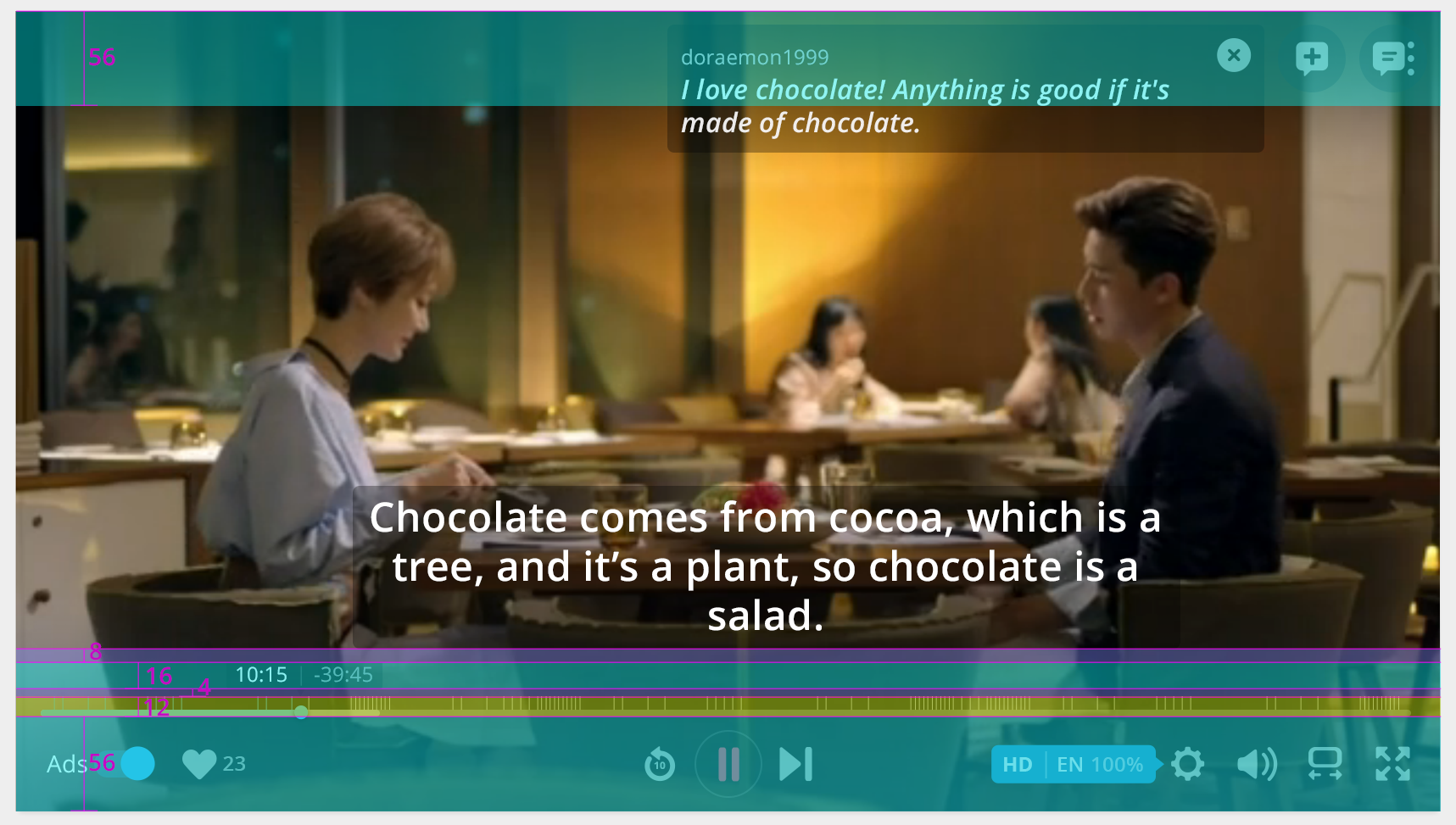
4dp and 8dp grid.
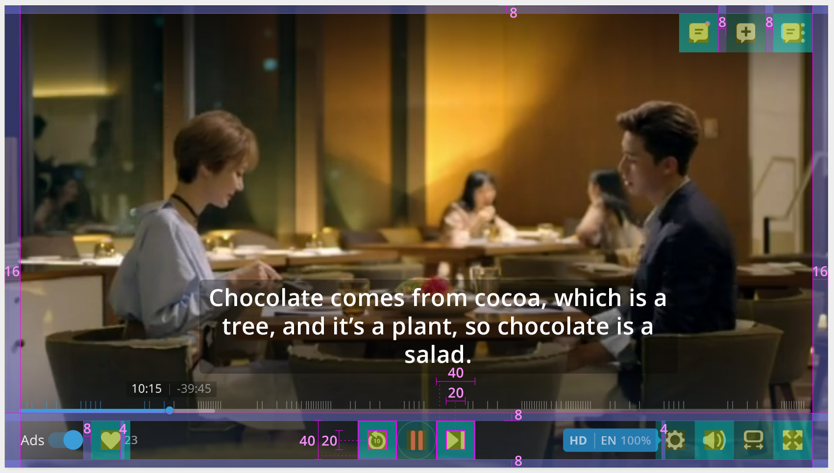
Making sure touch areas are easy to access.
Growing the community: Helping users to interact with each other
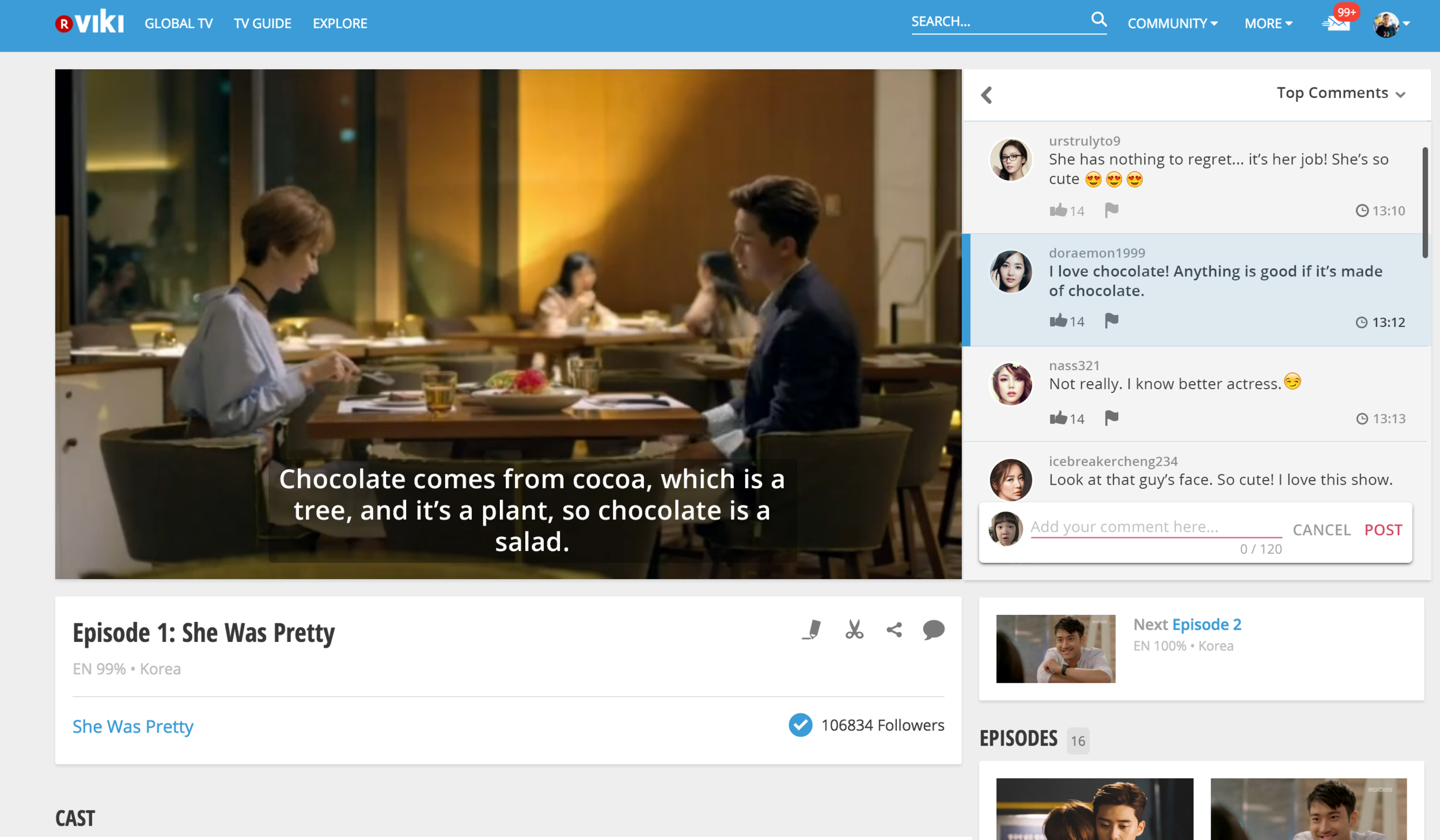
Real time comments section was added to engage users more and drive interaction between fans.