Role: Head of Design, hands-on.
Viki, a play on the words video and wiki, is the global TV site where millions of people discover, watch and subtitle global primetime shows and movies in more than 200 languages. Website is important to reach new users, get them engaged, and download the mobile app for deeper engagement with the community and better viewing experience. Before I came in March 2014, the website was made with desktop-first in mind. This wouldn’t work, especially if we’re aiming the next billion users, who are mobile-first with limited data and connectivity.
Get people to the content fast
Providing choices is good, it helps users to compare and decide the best option for them, but too much choices is bad. The old website had mega-dropdown, search, several landing pages with tons of filters, that the users need to go through before they reach the most important piece of content that matters to them: the video.
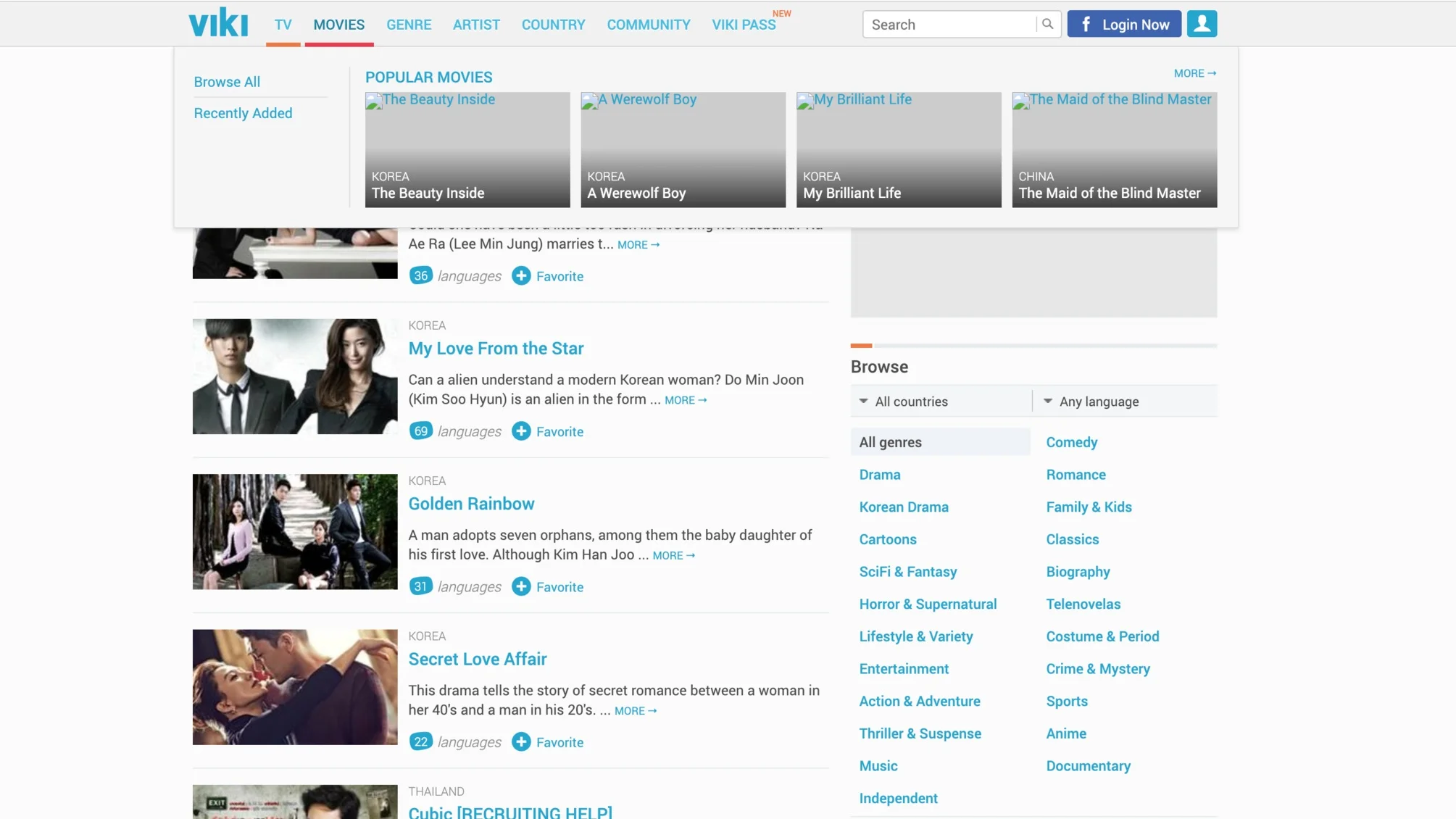
The interface in 2014.
Before we redesigned the site to be responsive, I wanted to make sure that we had a solid foundation: simple IA that helps users to get into the content fast. So we removed 67% of items on the top bar, remove some landing pages, and designed a new way for users to discover the content: an Explore Page.
Just do it, ask for forgiveness later
I did a quick mockup for the Explore Page, and together with the engineer, built the live prototype out of it. None of us were manager at that time, so we’re not sure if we could push the page to the real users, but we thought this was something that could improve the experience and the conversion significantly. I worked with the a data scientist, to make sure we tracked the metrics properly. We pushed the Explore Page to a small set of users, and anxiously waited for the results. The results were quite good, there was an increase of more than 50% traffic to the video page, compared to the old experience.
When we finally launched the Explore Page to all users, it showed even better conversion. There’s a conversion increase of 115% to the video page, from 32% to 69%.
We had a good foundation for the main experience, now it’s time to design the responsive site.
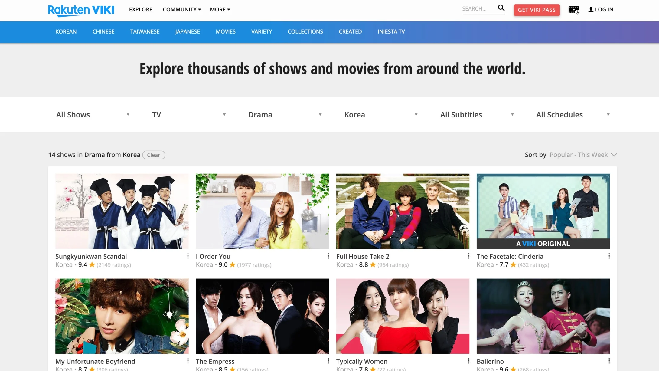
The Explore Page.
Help users to make a decision
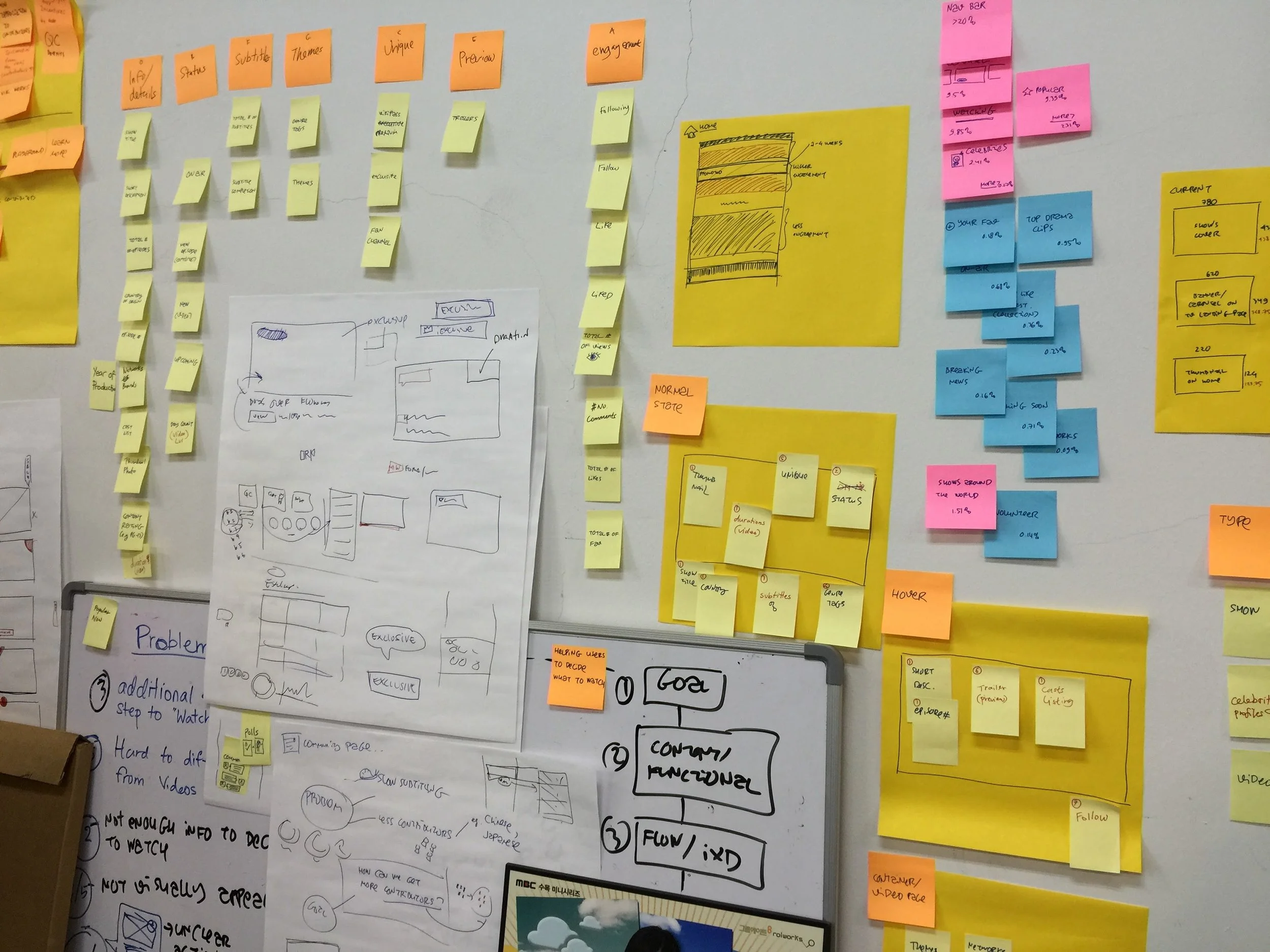
Users who download the app, usually have certain goals in mind. For example, to watch the latest Korean Drama. It seems simple, but there are some considerations when users were to decide which show to watch. Understanding the key considerations would help us to show only the piece of information that matters to the users to achieve their goals.
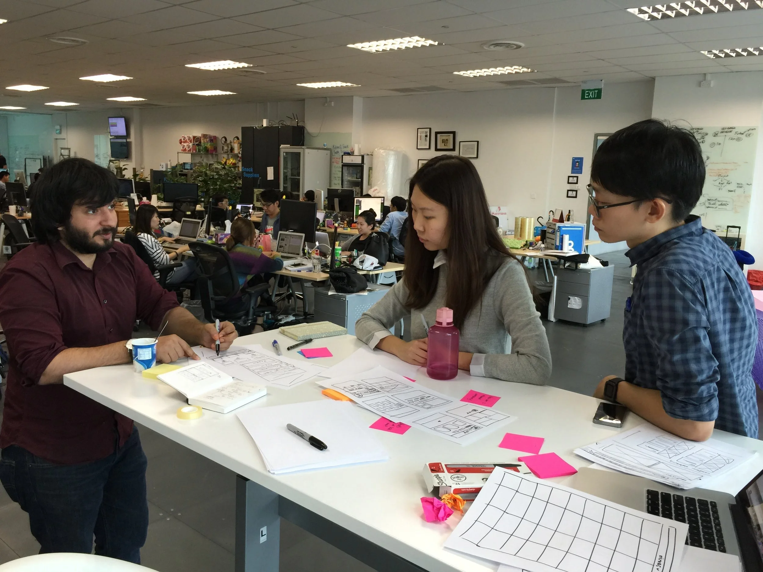
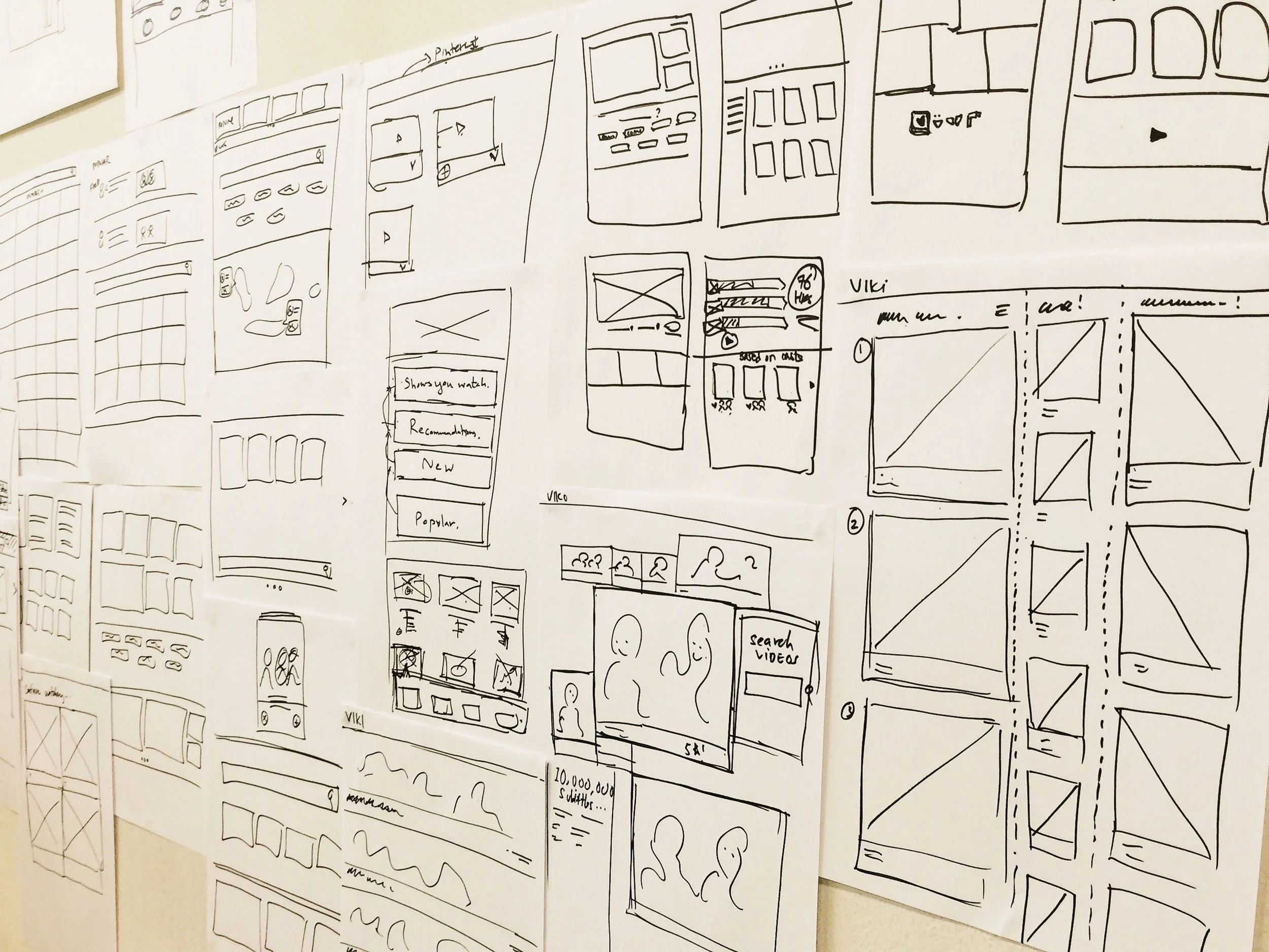
Design Sprint with the Product, Researcher and Designer.
We run some Usability Testing with the current site, online survey, and 1-on-1 interview with the users, to understand their decision making process. The insights were brought to the Design Sprint session, where we took those insights and sketched some tangible solutions, then we built a working prototype in 4 hours.
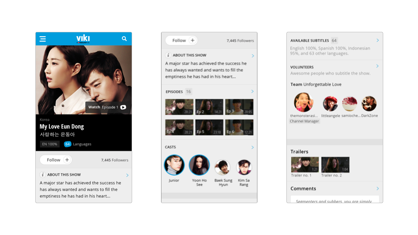
Removing the barriers
After the launch, we saw a 30% of sessions coming from mobile web. With the redesign, we’ve made the content accessible to anyone, even with a low-end smartphone. We’re removing barriers that stand between great entertainment and the fans everywhere, on (almost) any device.