Team
Role: Head of Design, built the team from 0, designed the early concept, designed the experiments.
Team: 6 Product Designers. 3 Researchers.
Overview
When Grab won the ride-hailing war in Southeast Asia against Uber, they expanded the focus to other services, especially food, which will be worth 13 billion dollars by 2020. They had been running food service for at least 2 years, but the experience was not good. In Indonesia, people use the rival’s service more—Go-Food, by Go-Jek, for so many different reasons. The goal was to be number one player in 2019 across Southeast Asia.
The impact to people: why GrabFood redesign was an exciting project
It has a huge impact to the people with low income and no job. Grab contributed to US$3.3 Bn to Indonesia’s informal economy in 2018, in the form of additional income for drivers and food merchants. The income per month for its bike drivers is increased by more than 100%, from around US$130 to US$270. From Food business itself, GrabFood contributed 20.8 Trillion rupiah, around US$1.5 Bn. (see the study by Centre for Strategic and International Studies (CSIS) and Jakarta Globe article).
Key challenges
When I was assigned to lead the GrabFood redesign, we had some key challenges, e.g:
Bad user experience, from discovery to fulfilment.
Low brand awareness compared to the competitor.
Everyone thought Design was only about making things pretty.
Constraints
Some constraints that we had at that time, examples:
For short-term goals, areas to focus to catch up with the competitors is: food discovery.
Need to improve on analytics.
Although eaters mentioned that estimated time was one of the key factors to decide, we didn’t have a calculation in place yet. and so on.
1001 features and a moonshot
I was initially leading the design for Grab’s Growth Team, focusing on new ideas, run them as experiments. Some of the experiments that are live now; Referral Experience, Gamification during in-transit, and the feed-model of a homescreen. When I was assigned to also lead the GrabFood Design, the Product Managers came up with a list of features, mainly driven by competitors analysis. It took some time and a lot of discussions to get the team to take a step back; understand the user needs, goals, challenges and context, get aligned on the business vision and goals, and assess the technology capabilities. We can’t have 1001 features just because we can.
To kick start the process, we run Usability Testing and Focus Group Discussion for the existing app and organised a Design Sprint session. The goal was to come up with a moonshot and a working prototype that’s validated with the real users.
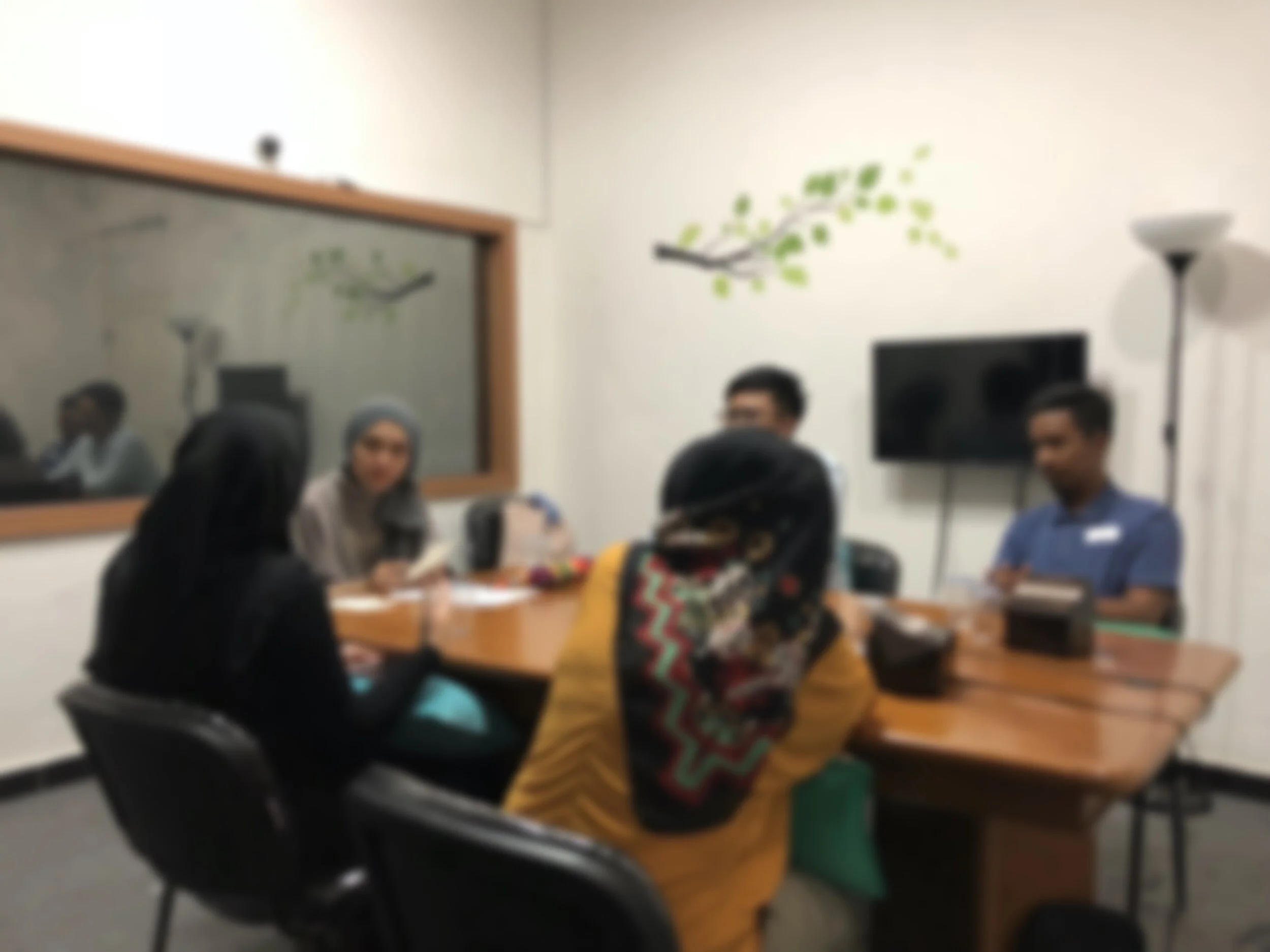
Design Sprint with teams from 5 different countries
The teams were in 5 different countries; product, design, business, operation, and tech. One of the key points to discuss was the business vision and success metrics. When everyone was aligned on the vision and the metrics, then every decisions-including design direction, should support the vision and help to achieve the metrics. We answered the question, “Where do we want to be in 6-12 months?”
The sprint started with a high-level map of the ideal experience. Food service is complicated, because it’s not only about the consumer (eaters), but also about the drivers, the merchants, and the customer services. The sprint had dedicated session to share and talk about user insights; from market research, FGD, to Usability Testing. We also talked about the product evolution and technology capabilities. When we had enough insights and decided on the key problems to solve, we continued with collaborative sketching.
Different services that we reviewed as inspirations.
In the sketching session, everyone was asked to sketch the solutions by himself/herself, then only shared his/her ideas with the team. For eaters experience, for example, we explored 64 different concepts for the discovery experience, narrowed them down to 8 concepts, then built a working prototype of 2 different concept. The process until prototype took 2 days, and the next day we were ready for Usability Testing.
The design challenge
When we started the design, I-as the design lead, set our design challenge
“Design an addictive, engaging and delightful product that helps users to quickly find the food they want. #10xNot10Percent.”
Reflective, behavioural and visceral aspects
The design team created a high-level guide on the design principles that’s mapped to Reflective, Behavioural, and Visceral aspect, examples:
Reflective
Helping users to make a decision, to choose and get a fresh and tasty food, worth the money and waiting time.
Behavioral
Clarity over simplicity.
Visceral
Playful.
User’s mental model
Based on our user research, I proposed the approach for the homescreen, that followed user mental model when exploring food app, examples:
I know what I’m looking for.
I’m being lazy. Quick, give me suggestion.
What’s nearby? I want to get things quick. and so on.
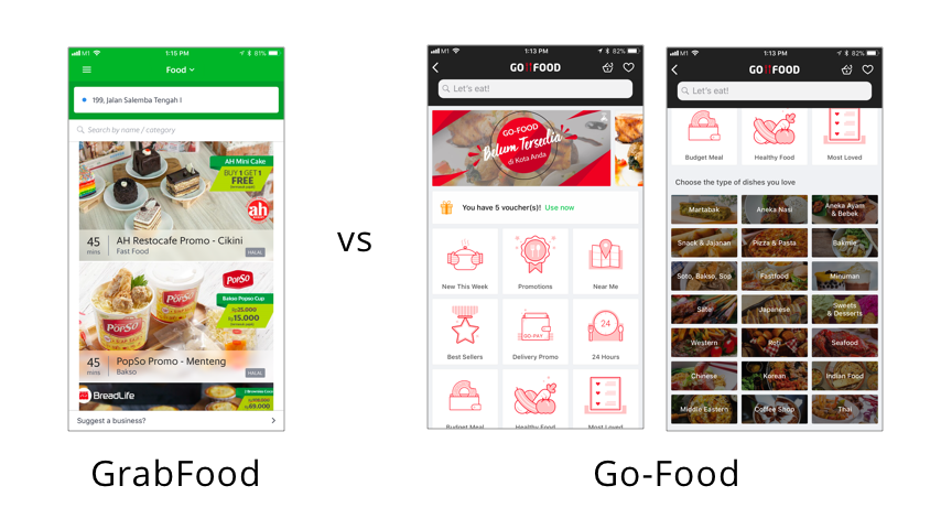
The old interface. GrabFood vs Go-Food in 2017.
Variants we explored
From 50+ different concepts, we narrowed down to around 5 concepts: From a Food-Chat approach, health-focused, social-focused to the common social media-like experience.
Sketches for the design that we chose to prototype.
The new concept
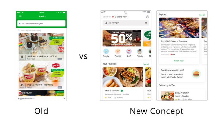
The old interface vs the new concept.
Went to the ground
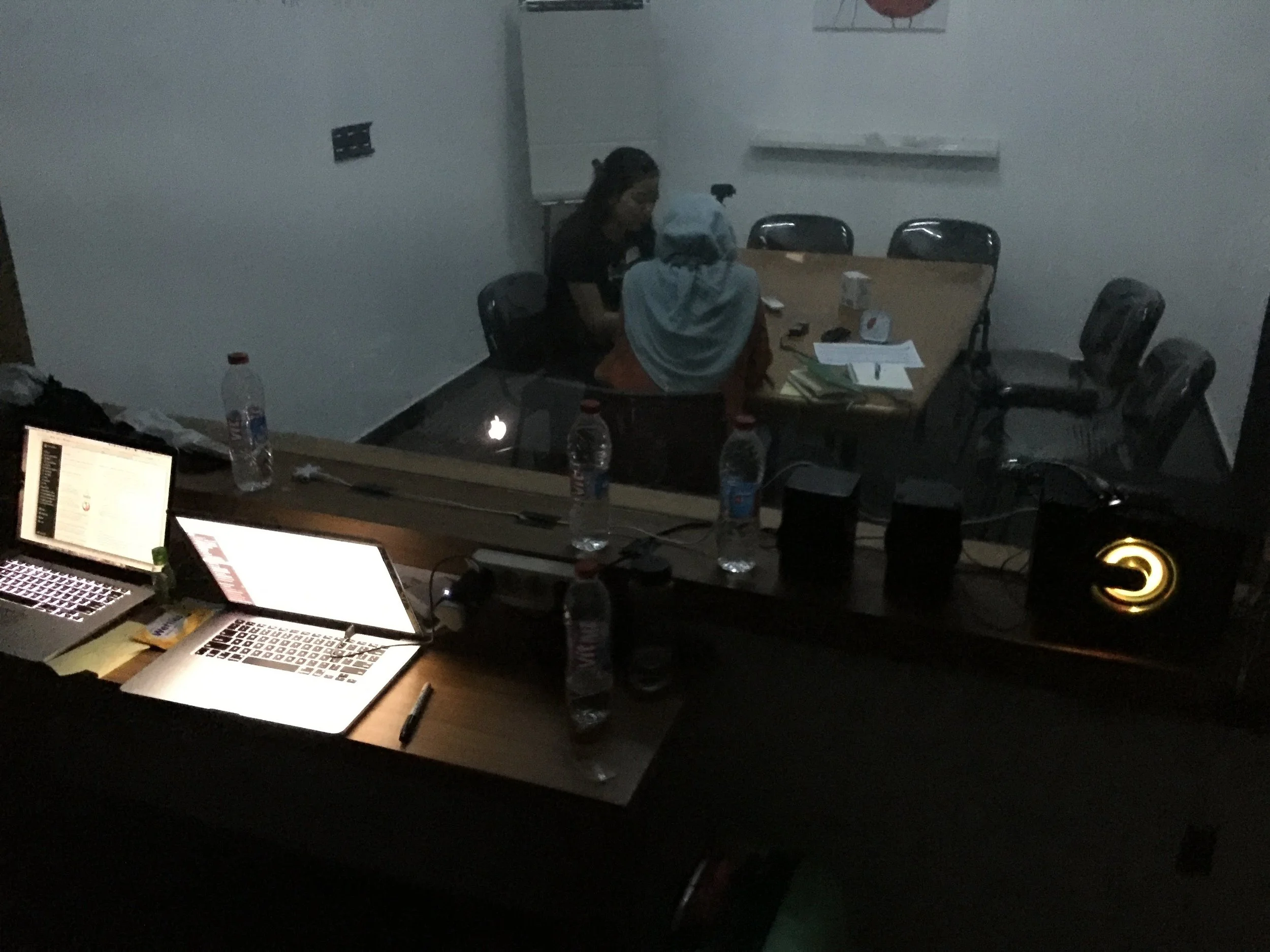
Understanding user needs, goals, challenges, and context is the key to innovation. We flew to Jakarta, and tested the prototype with the real users; eaters, drivers, and merchants. There were things that we thought it’s easy and understandable, but the users got confused. The merchant app to manage the restaurant and the menu, the search bar that’s “invisible” on eaters app, and the confusing term on the drivers app. These insights helped us to improve the app in relatively short time, and we’re able to come up with a moonshot version of the app in 3-7 days.
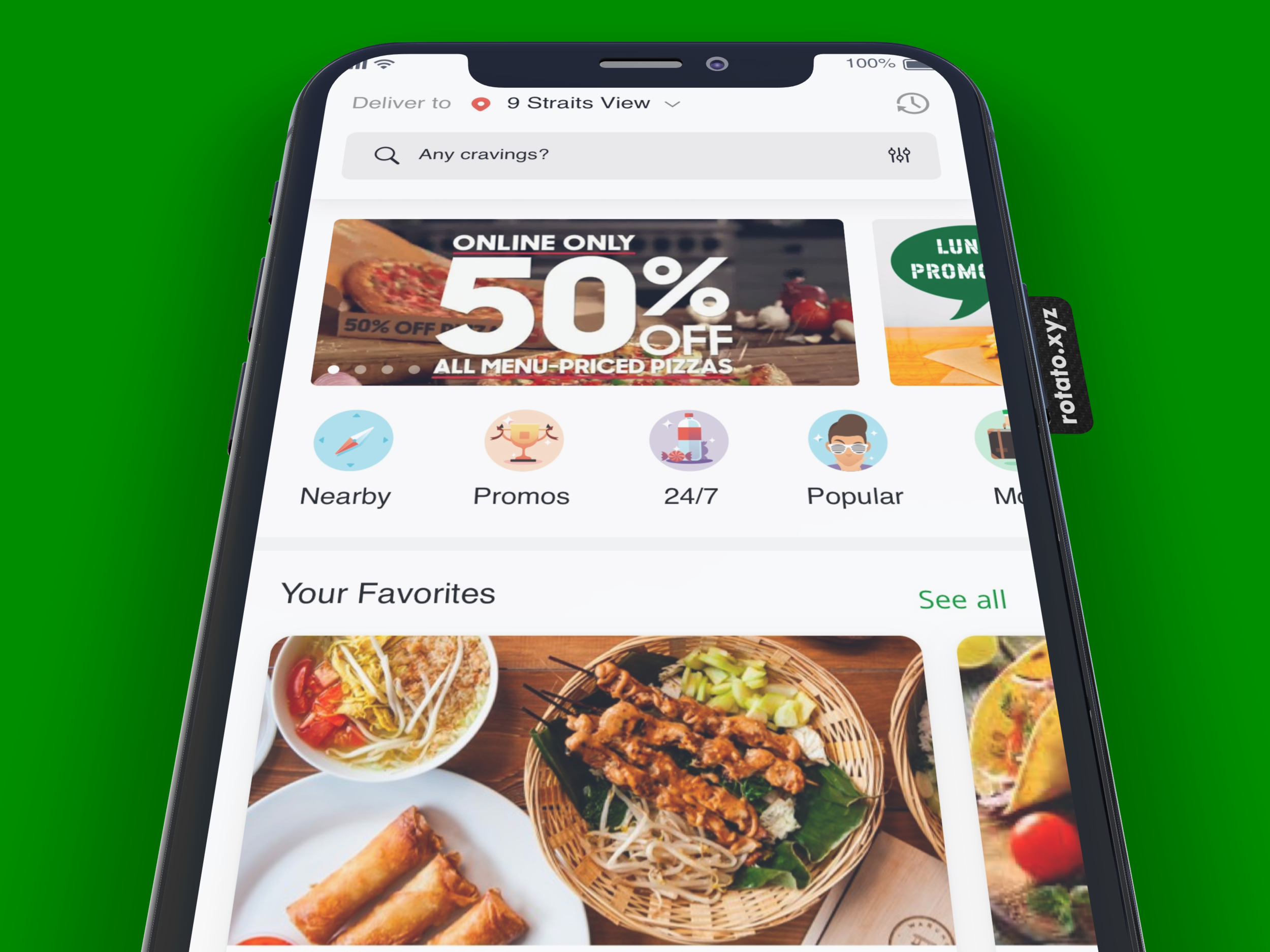
Consumer/eaters app. The new and improved GrabFood for eaters.
Clearer vision and the measurable outcomes
Kano Model to lead the discussion on features to build. The discussion of Kano Model was led by the design team.
With the moonshot version that had been refined after user research sessions, the Businesses, Products and Engineers had several discussions to prioritise the features to build. With a clearer vision and metrics, it’s easier to see and plan on how things can come together for the next 12 months. Of course there’s no perfect moonshot. We need to keep learning from the users and the data, adapt to business needs/goals, but with a solid foundation of product strategy, the goal to be number one player in Southeast Asia is not impossible.
Within 2 months, an increase of 7% users browsing the homescreen of Food, and a 30% increase in conversion to the basket.
Another great achievement, and I would say that design plays a significant role as well in making sure the product is usable, useful, and engaging—is the 10x growth of food being delivered, between December 2017 and December 2018 (see the article in Bahasa Indonesia: Grab Celebrates Some Latest Achievements in Indonesia).
What if I have unlimited time and resource?
The current solution is still demanding people to actively browse for food. Too many decision making process. We’re not making it easy for people to decide on the simple question, “What should I eat now?” Another aspect is the driver. We haven’t thought of significant ways to improve their overall experience, including the quality of their daily lives. There were some interesting insights that led to some cool ideas:
Image recognition using ML to suggest food. We learned that people use Instagram or Facebook a lot in Indonesia to discover food. When they saw a celebrity, for example, eating some food, and they didn’t know what food was it and where to order, they would take a snapshot and share it to a WhatsApp group, then asked “What food is this?” “Where can I order this food?”
Live kitchen cooking, similar to Facebook live video. Especially in Indonesia, people are very social. Live kitchen is about community around certain food or restaurant. The goal is to drive engagement with the brand and the people.
Magical recommendation. This is not just about sorting by distance, price, or popularity. It’s about the best value, taking into consideration people’s past purchase behaviour, purchasing power (also taking data from our transportation service), popularity, and also a way to predict future preference, so people can discover new food easily.
Photo-licking good. The images don’t make people hungry. What’s better is a simple way to make the photo alive (e.g a particle effect, like smoke, to show the freshness of the food), and make people can’t resist to not ordering it.
Social food delivery. According to a study from the Economist Intelligence Unit, Indonesia is the world’s second largest food waster, binning almost 300 kg of food per person each year. There has to be a feature to simplify the distribution of food wastage using our service.
Make it double. Provide an option for the eater to order double. The other portion will be given to the driver.
Social engagement. Conversation around food or restaurants.
Design a better reward system for the drivers to earn one meal a day. It’s quite sad that many Indonesians are struggling to eat once a day. I heard sad story about a driver who eat one portion of instant noodle every morning and share it with 3 people. We’re not only designing a product and features. It should be a complete great end-to-end experience for eaters, drivers and merchants.