Role: Facilitator, Mentor.
Indonesia with its 268.2 million people, has a huge potential to become the 7th largest economy in the world by 2030. More than 75% are unbanked, with less than 5% have credit card. The government initiated a cashless movement since 2014, called “Gerakan Nasional Non-Tunai”, which means “Cashless National Movement”, aiming for an easy, safe and efficient financial transaction. Only for the past 2-3 years, cashless is getting popular, thanks to the all-in-one service like Go-Jek; where users have their own wallet and pay for many things-like transport, food, groceries-through their phone. It also allows payment at street food stalls-using the Go-Pay service, like in Jakarta, where most of the people spend their money for food.
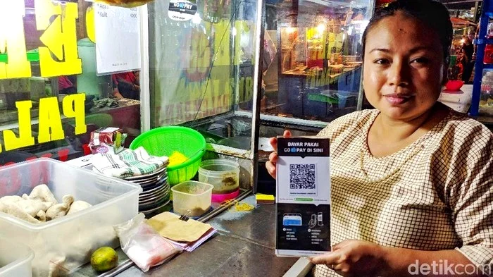
Cashless payment at a street food stall. *Image from detik.com
TCASH, a mobile payment service by Telkomsel-the largest mobile provider with 190 million users-started the mobile payment service early in 2007. The adoption was low at that time. Only in 2015, when the awareness was high and TCASH introduced an innovative NFC payment, people started using the service. Currently the competition is tough with competitors like Go-Jek, so we need to keep innovating; listening to user feedback, iterate and launch quickly with solutions that’s useful, relevant and engaging.
Alignment on the long term goals and success metrics
We used Google Design Sprint for the redesign project. It started with a day of intense discussions between cross-functional teams: product, design, engineering, operation and marketing. The goal by end of day 1, was to understand more about the users-their need, goals, challenges, and context, the business-goals and metrics, and the technology-what we can or can’t build (now).
We managed to answer the question “What is it all about?”, with “An integrated payment service in lifestyle and micro segments, that is trusted, delightful and innovative, for 18-30-year old.”
Some leads from business, product, and engineering shared a lot of useful insights, including the long term business goals and the focus for each quarter, including the metrics to measure the success of the product, e.g 80% of quality active users, with 4 transaction/month.
The product team shared some insights about user research and product evolution. Aside from promotions that attract users, some mentioned that using TCASH makes them look cool among peers. This was a good insights that could be useful when it comes to the design and campaign part. We need to make sure the design is not outdated, and when speak in a casual tone to the users.
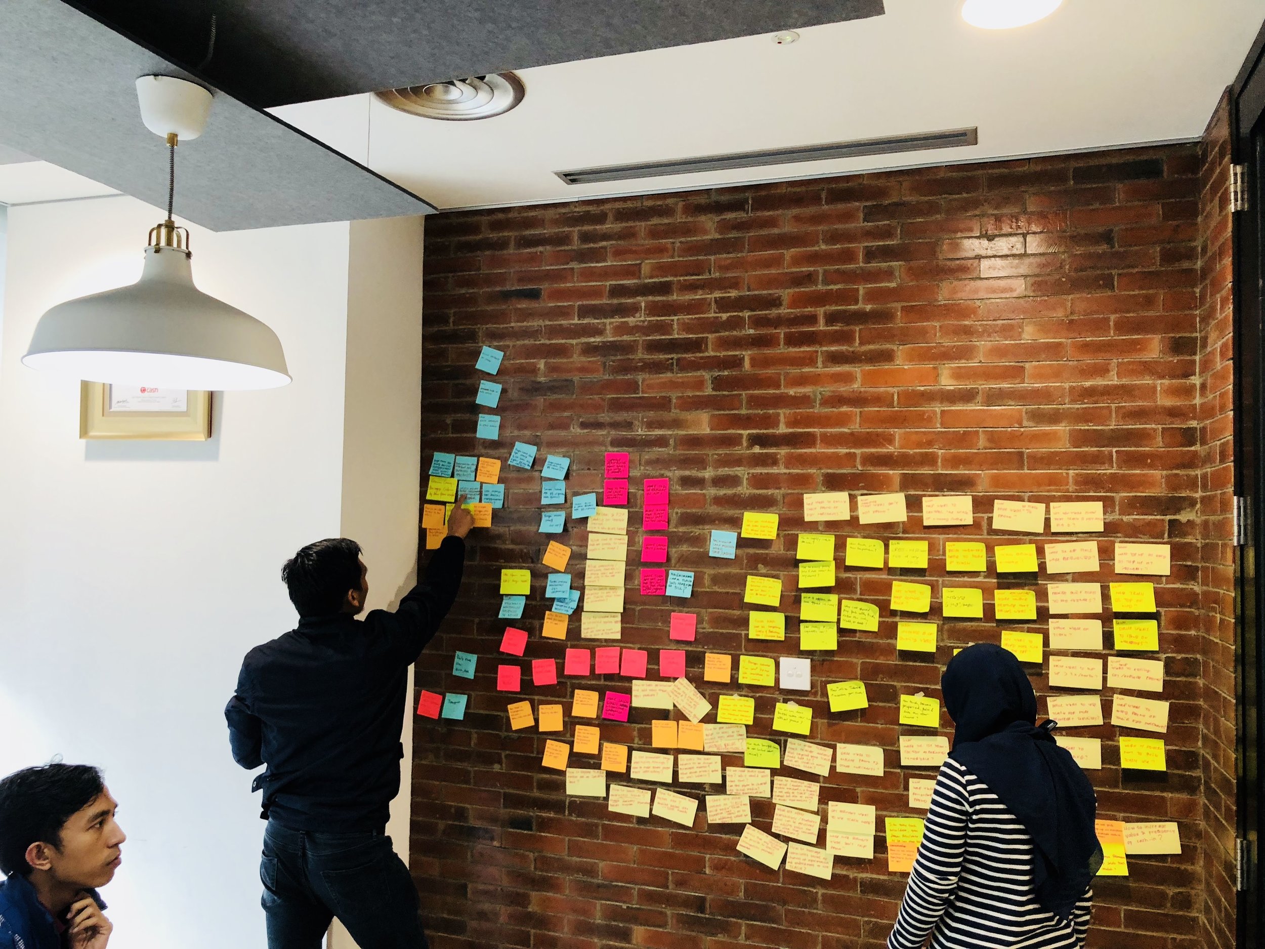
Going crazy with Crazy8
After we had enough insights from different multiple point of view-management, product, user, competitors and technology, we continued with exploring as many ideas as we can using Crazy8 method-which is part of the Google Design Sprint method. Each person was involved-not only designers, to sketch as many concept as he/she can. We came up with 64 different concepts for the homescreen, then we narrowed them down to 8 different concepts.
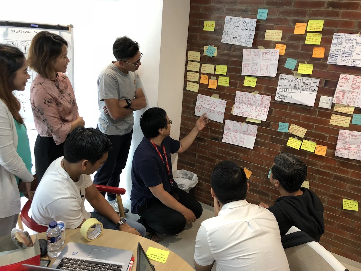
What if…? and How…?
After going crazy, we continued with the 8 different concepts. Along the way, we kept asking “What if…?” and “How…?” Engineers were also in the room, so at the same time we’re assessing the technology feasibility to build the things we sketched. From 8 different concepts, we merged them into 2 winning concepts that’s going to be built into working prototype, and would be validated with the real users on the 3rd day. It took around 6 hours to build the working prototype, and we’re ready to meet the users to validate our hypothesis.
The ultimate decision maker
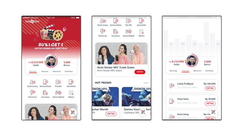
We can always think of the best ideas in the world, and design the best app based on those ideas, but ultimately it’s the users who decide whether our design is good or bad. Whether it’s useful or not to help users achieve their goals. We run Usability Testing with 5 users, which was good enough to gather insights. One of the surprising findings was, all users complete ignored the top banner, which took 1/3 of the screen real estate. We thought with such big placement, people would have noticed it. They didn’t.
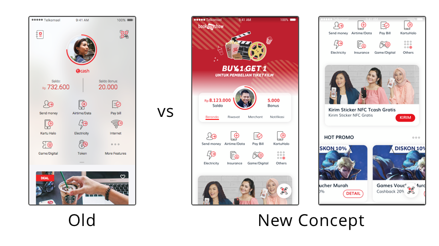
One of the significant improvements, was the placement of the pay button (Scan QR). The old design had it at the top right, which is always a difficult area for our thumb to reach. We moved it to the bottom, and all users were able to tap it quickly when asked them to make a payment.
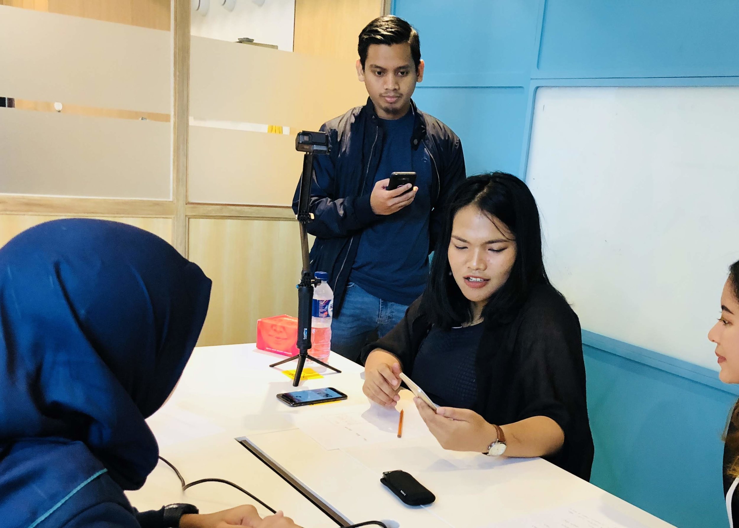
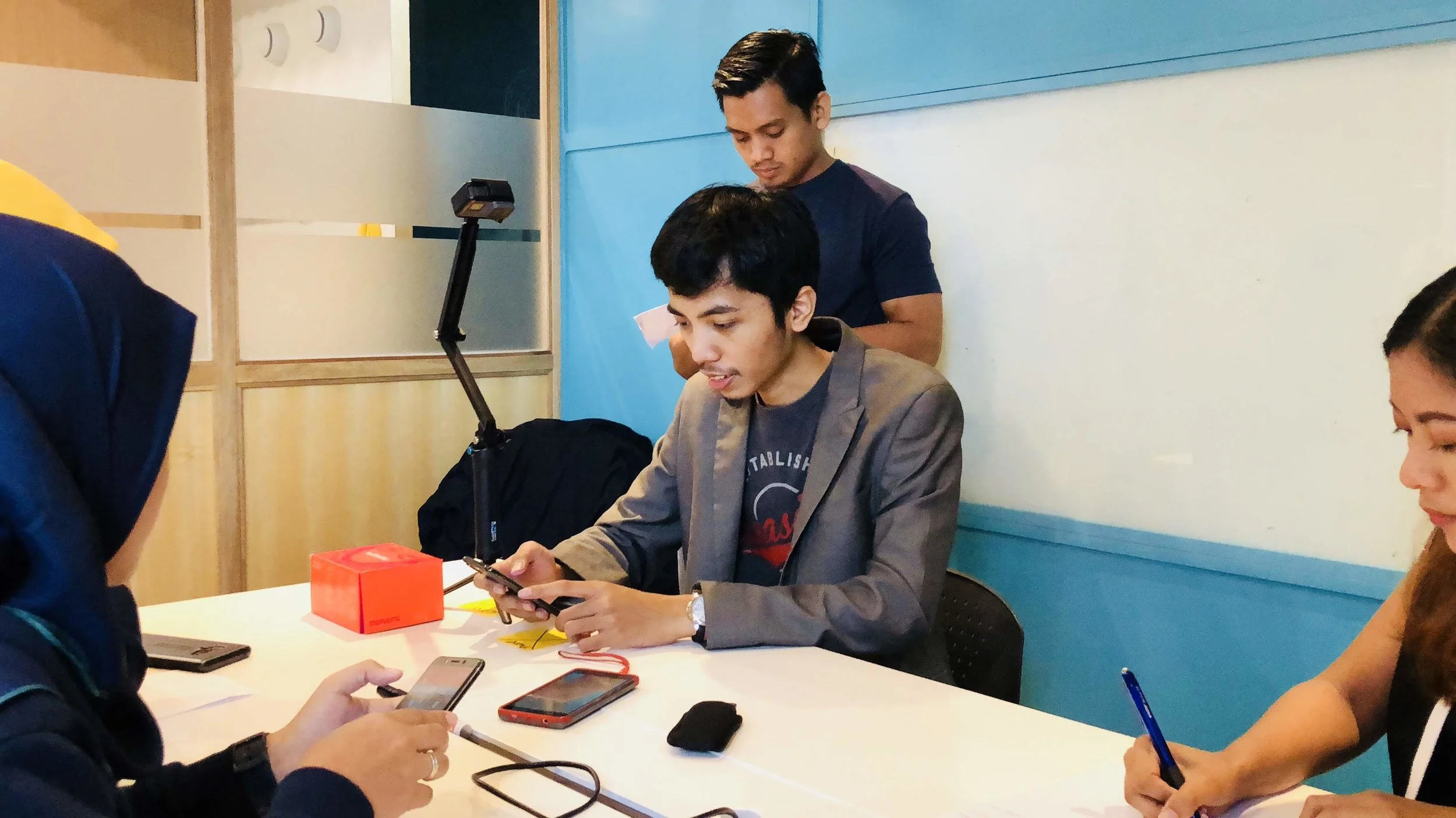
From the qualitative feedback, we had achieve our goal; to create a lifestyle payment app that’s delightful. People related it more to a lifestyle app, unlike the old one which felt like a boring utilities app. It’s a great start for a refreshed design, and the team has built the momentum to keep improving the experience, to make it more usable, useful and engaging.