Overview
Role: Lead Designer, hands-on.
Team: Lead Designer, cross-functional teams.
Singapore, with its 5.83 million people, almost 50% have credit card, but only less than 10% have mobile money account. Singtel Dash was the first all-in-one mobile payments solution, from paying taxi to remitting money overseas. The potential is huge for mobile money account, and the challenge is to get people to use it more. Aside from redefining the product and user experience engagement strategy, it also starts with making the app simple.
Achievements
~35% of increase of pay to merchant. 30%+ monthly active users. Asia Pacific Mobile Wallet Provider of the Year from Frost & Sullivan.
Product and user experience engagement strategy
“Old habits die hard,” as the saying goes. When I asked a friend, why he doesn’t use Dash, he said that he’s just used to the debit card (NETS). “Also, there’s no strong pull factors to use Dash, for example cash back promotion.” Sadly, Dash has ongoing cash back promotion. It’s not known.
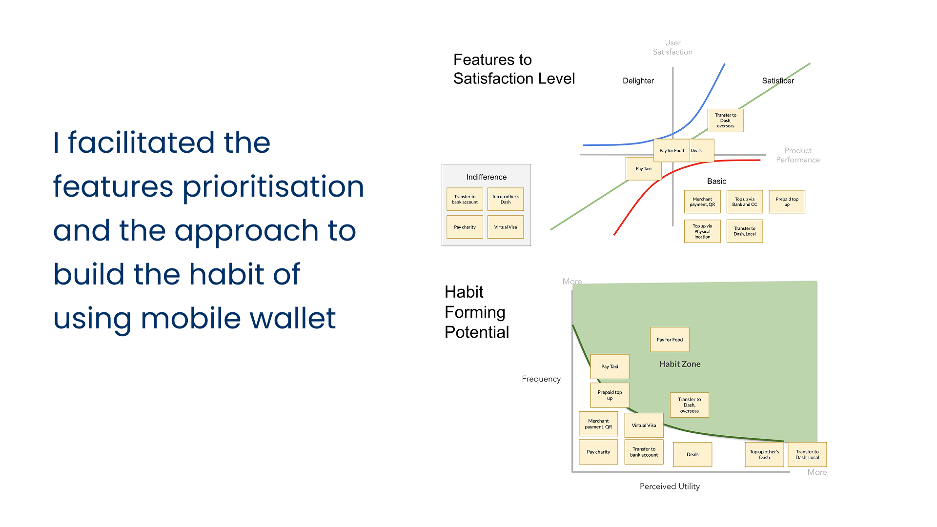
Something can become a habit, if it’s used frequent enough (even though it has low perceived value), or it has a high perceived value (even though it’s not used frequent enough). For mobile payments to become a habit, we think it needs to focus on the frequent usages: food, transportation, and groceries shopping. Of course we can do another 1001 things, but for the first 3-6 months, or even 12 months, the goal is to drive usage on food, transportation, and payment. Once everyone was aligned, from the Business, Product, to the Design team, the effort from each team will be directed to that goal.
Unnecessarily complex product
The current app looks and feels complex. Key call-to-action is not clear, it’s difficult to find things, and deals-which actually has a lot of interesting offers for the users-was not visible. Here’s the snapshot from Google Play.
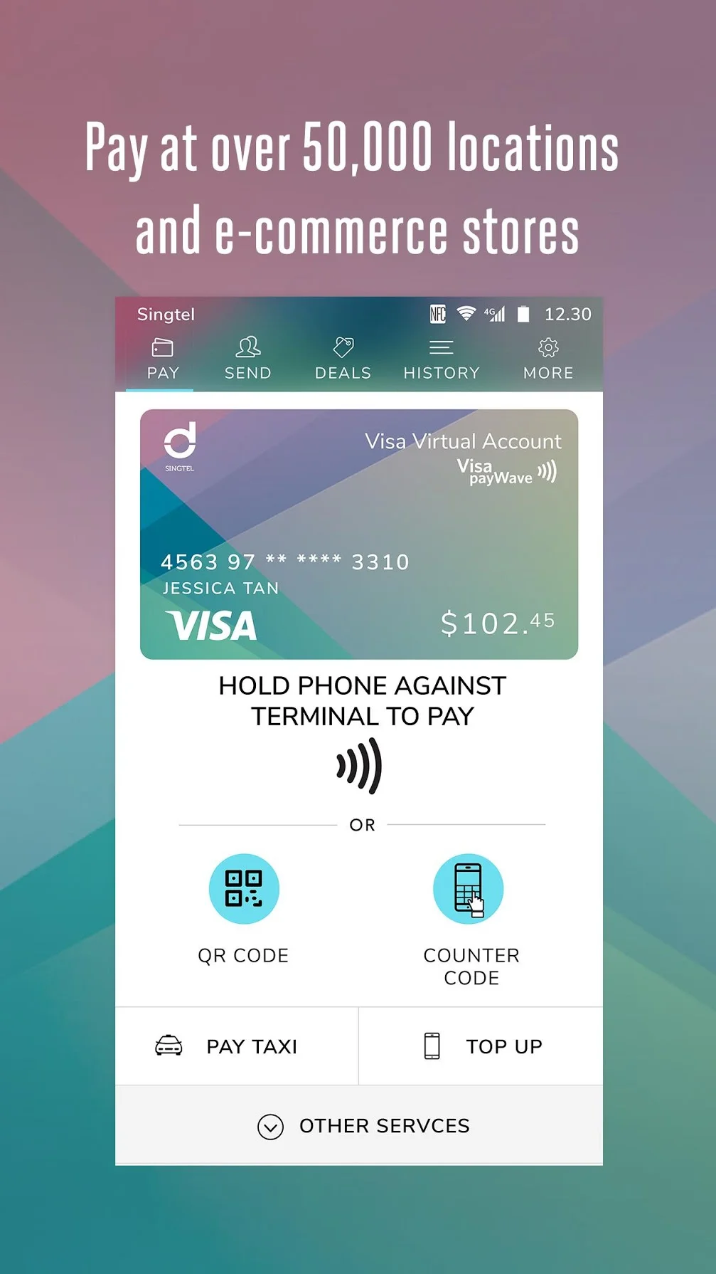
The existing app that looks and feels complex.
Measuring success
After we all agreed on the goal, which is to drive usage to three key usages-food, transportation, and groceries-we continued with setting up the metrics. This was also helpful from the analytics side, because before there was no proper analytics built. One example of the metrics we measure-with the goal to increase taxi payment using Dash-is the number of taxi payment/user/week. With a clear metrics, we’re able to tell if the redesign were succeed. If we didn’t achieve the metrics, then we have something as a benchmark for the subsequent iterations.
Went to the ground
We went to the ground to see how the app was being used. We wanted to also see the interaction between the user and the merchant staff. One of the biggest challenges was the staffs who didn’t know how to accept the payment by Dash, and they kept telling us to use either NETS or cash payment. One interesting finding was that although it’s only a split-second, I could see that it took some time for the user to scan the homescreen before he tapped the QR Code button. Another thing we noticed was the placement of the QR code that’s hidden. This was a good insight for the acquisition team as well.
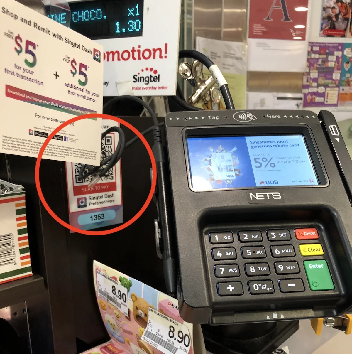
The QR for Dash payment is hidden and difficult to reach.
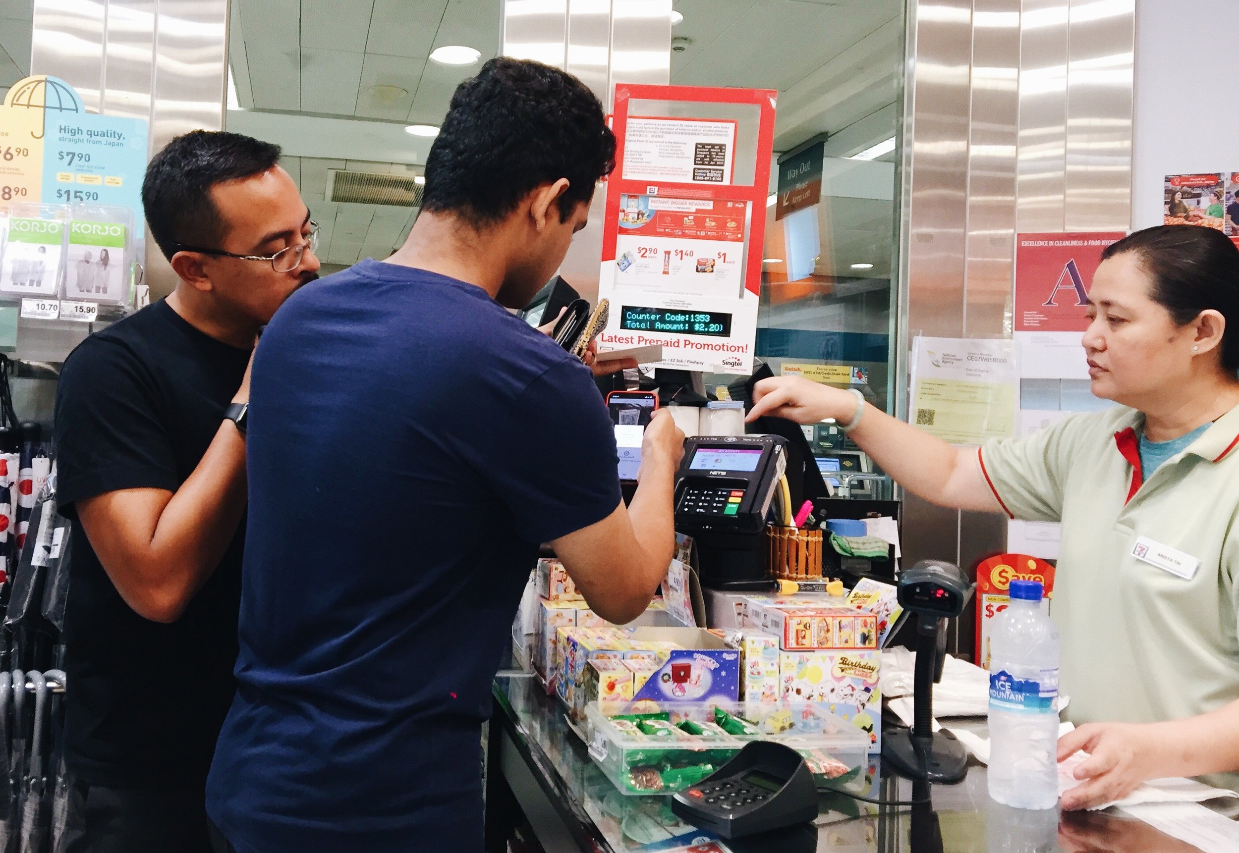
Contextual Research. Observing how user makes real transaction.
Redesign of the homescreen
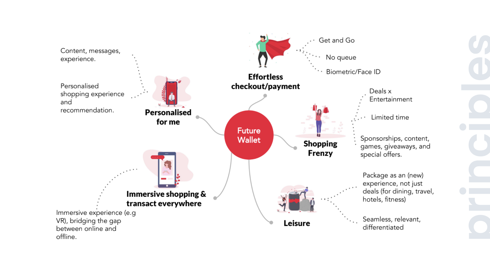
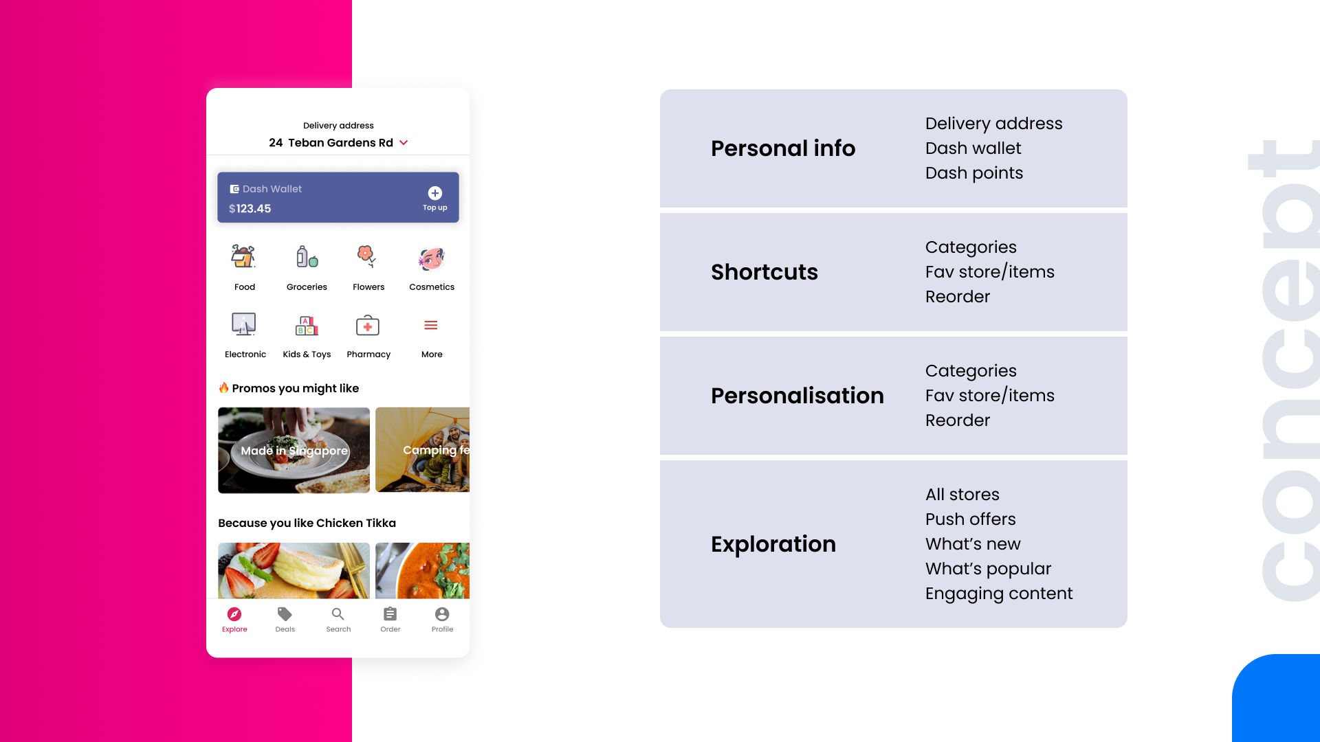
With the goal set and insights gathered, we did collaborative design sprint to come up with the new homescreen and overall concept of the improved experience. We applied basic principles of simplicity to make the app simple. First is about Reduce-remove things that’s not necessary. Then we continued with Organise-grouping of features/content. The last one is about Time-saving in time feels like simplicity. We wanted to make the call-to-action clear-the QR payment feature-and easier to access (thus saving people’s time to scan the screen to find the payment button). We also made it clear of what the app can do, especially to pay for your food, taxi, and groceries.
The deals are shown upfront on the homescreen, because people love deals-especially the cash back. Some might argue that it’s not a good long-term engagement strategy, which I agree, but our goal is to build the habit of using Dash as a mobile payment in 3-6 months. After 3-6 months, we’ll have different engagement strategy.
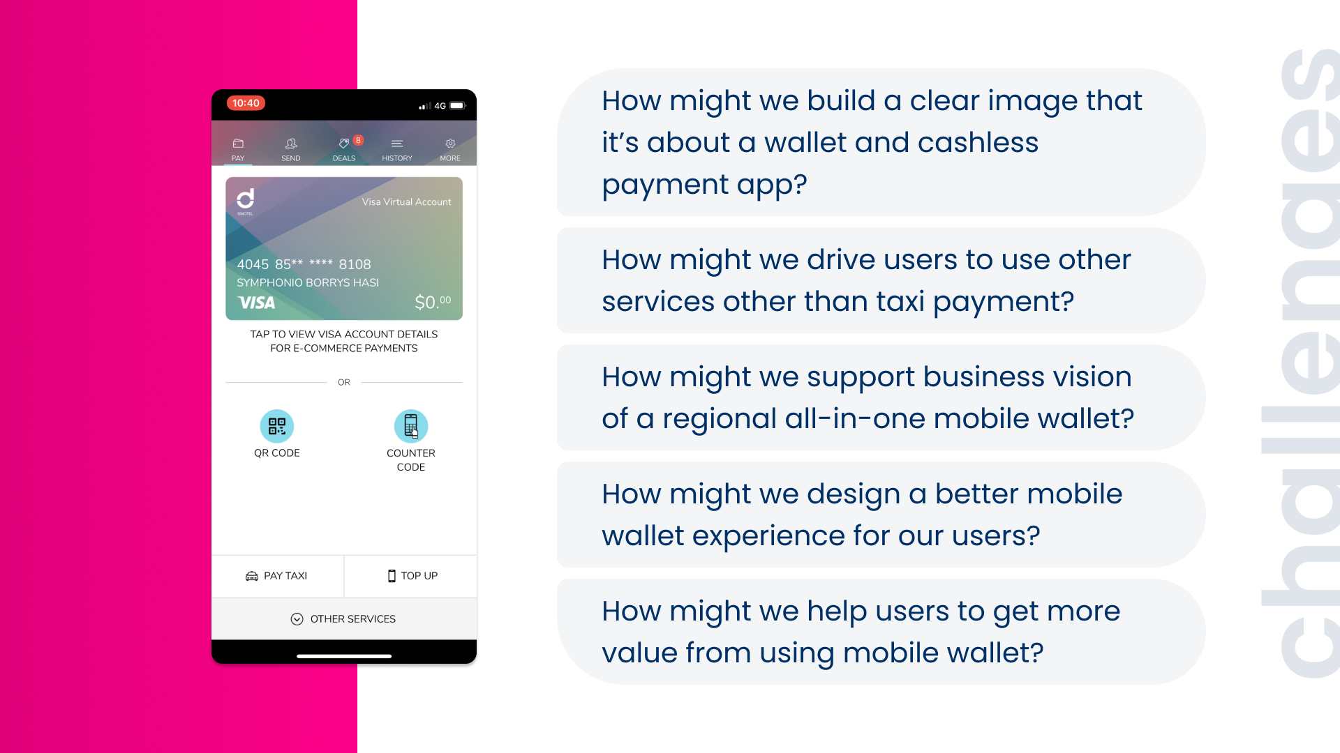
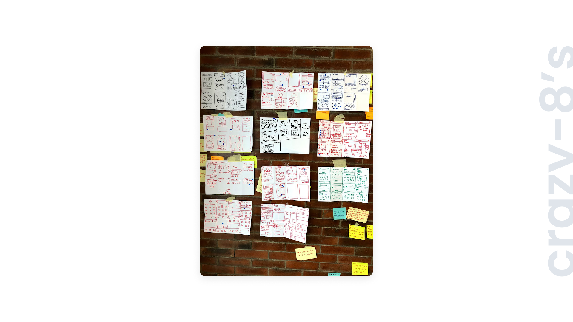
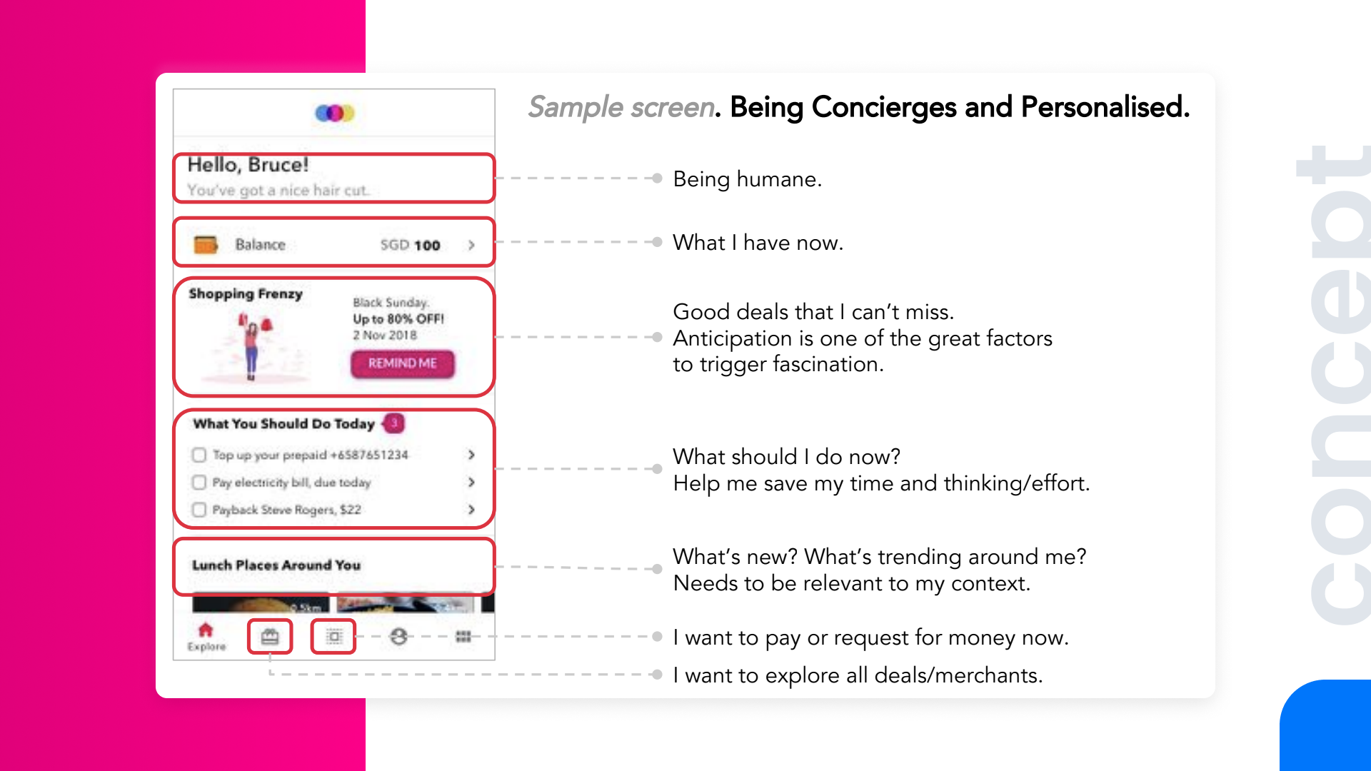
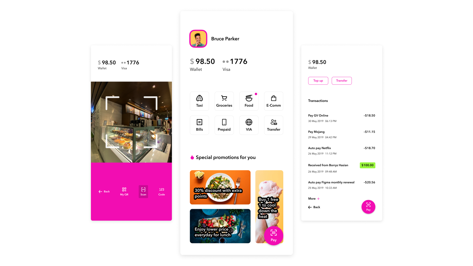
One of several visual explorations. Focus on simplicity.
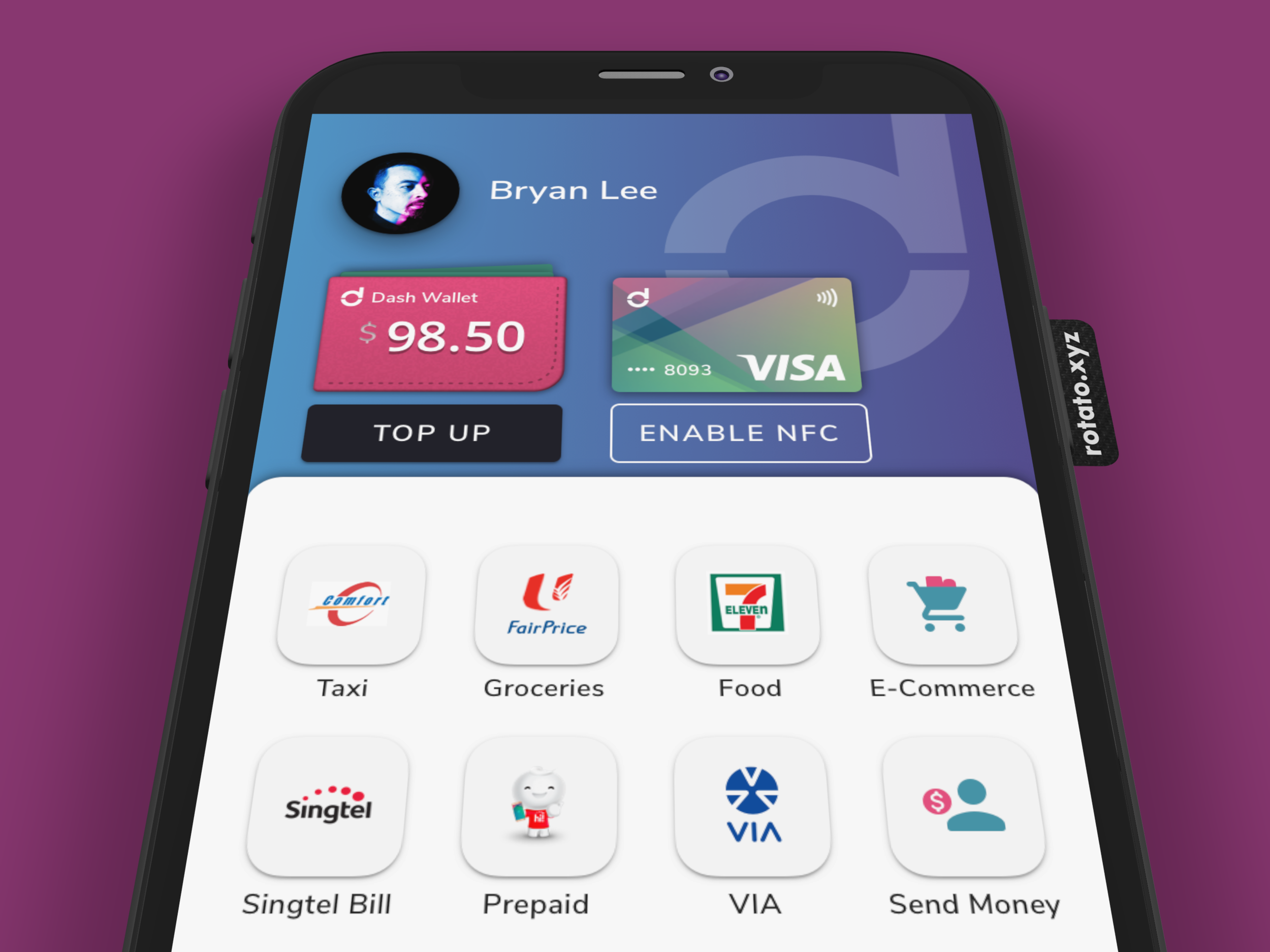
The improved homescreen, using 80% components that we already had.
The first step win with ~35% increase in transactions
The redesign of the homescreen was a great first step win. We managed to move faster, and this is something that we’re proud of, considering Telco company who usually doesn’t move as fast as the tech companies. It’s also the first step to make mobile payment works for everyone; by making it simple, focusing on key usages, and helping people to achieve their goals better. Not only that, we saw an increase of ~35% in transactions. This helps to show the value of design to the business.